
One of the simplest design elements is a line. A line is the building block of every two dimensional shape. In its basic form, a line is a fluid connection between two or more points that has length, thickness and direction. Lines can be used to define a space, organize design elements, direct the user’s eye, and create mood, emphasis and flow. For the reasons above, learning how to use a line effectively is very important to mastering the design for your website, banner or any other design project. Below are various ways lines can be arranged to provoke different moods.
Line Organization and How it Creates Mood
Vertical Lines – Vertical lines can symbolize power and strength, especially if they are bold. Think of skyscrapers and monuments, both of which guide the eye and mind upward toward God and Heaven. Think of the architecture in old churches. Beams and buttresses are typically vertical so that they lift your eyes upward. In web design, vertical lines can define columns and sidebars as well as help the viewer know that they can scroll down for more content.
Horizontal Lines – Horizontal Lines tend to subconsciously point us back to the horizon. It is like looking out onto the sunset or sunrise and seeing a long line stretch across the sky. Because of this, horizontal lines create a feeling of calm and relaxation. Using horizontal lines tend to be more subtle, while vertical lines tend to be more dominate. In web design, horizontal lines are key to creating defined spaces across your web page. Using horizontal lines across the web page is refreshing to the viewer. Too often, we can divide the web page up vertically, but have an endless middle section that scrolls on forever. Remember to break the page up not only vertically, but horizontally too!
Diagonal Lines – Diagonal Lines are dynamic. They create a lot of energy and excitement in design. They can quickly and easily grab your attention and pull you to another place on the page.
Wavy Lines – Horizontal wavy lines really tend to give off either a “beachy” calm or a tense, heat wave feel. While waves of calm and peace can be represented, if done right, vertical wavy lines can also invoke a feeling of unstableness, unrest and tension. Playing with how loose and tight the waves are will make a big difference in these effects.
Thickness – The thickness of the lines plays an important part in defining what mood they’re going to produce. As mentioned before, thick lines project a bold, powerful, strong feel. Thin lines can be used to create subtle textures, light and airy moods, and move the eye around the page in a subtle manner. Combing thin and thick lines can utilize hierarchy and create a dynamic design.
Examples in Design
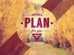
Bold diagonal lines grab attention, focus direction to the center, and produce an image of strength. The thin horizontal lines in the logo organize content while remaining subtle and inconspicuous. They also create a sense of unity and consistency within it.
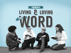
Hairline Diagonal lines create direction. They help move the eye to important places in the design. Notice that the three different styles of lines together create a visually interesting layout.
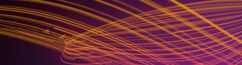
Lastly, here’s an example of thin diagonal lines used as background texture. The use of diagonal lines helps this piece feel more interesting and dynamic, while remaining quiet and almost unnoticed in the background.
We hope that you find this information useful in your church design endeavors. Good luck and happy designing!