
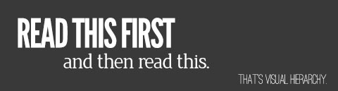
One of the most basic and important principles of design is visual hierarchy. Hierarchy helps determine what the primary, secondary and supporting elements are in your design. Before you start your design, carefully think through what content should be presented in which order and what your goals of the content are. The following are tools you can use to construct hierarchy: size, color, tone, repetition, weight, texture, density and position. Here is some info on a few of these.
Size
Size is especially useful regarding type. Our brains are wired to read large type first. We recognize that larger text is more important than smaller text, so we look to it first for information. Size can play a useful role with imagery as well. Let’s take a look at one of my designs for Sharefaith and discuss how I used these tools to create hierarchy. The order in which the viewer sees the elements on this page is first – “I AM GOD.” The viewer’s eye then
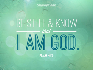
goes up to “Be Still & Know,” and continues to read down through “that, I am God.” Lastly, they read the scripture reference,
and logo. All of this happens in less than a second or two. So how did I get the reader to instinctually read what I wanted them to?
Color and Tone
“I AM GOD” has the most visual contrast on the page, and causes the viewer to read there first. It is the largest item on the page, uses high contrast in color with the background, and is contrasting with the other type on the page by using a different weight and style, which in this case creates some texture. Colors with higher contrast in relation to each other will give that added “pop” that draws the eye in. Think about the color tones that you’re using and make sure you have light and darks together where you want the viewer to look first.
Position: Orientation, alignment and placement on a page have less impact in design than tone and size, but still offers some guidance. Generally, a western reader will read from top to bottom and left to right, but in this design that instinct is initially overruled by the contrast created.
The centered positioning of the main text helps guide the reader to the most important information. The verse as a whole is also the densest item on the page, which creates a focal point and guides your eyes to the center. This arrangement of visual elements to create hierarchy is of course just one example, but hopefully you can see how combining the different tools will help you put visual emphasis where you want it first. Keep these tools in mind when working on any media, from your church’s website to banners and everything in between. Happy designing!