PowerPoint Sermons are about presenting information, usually as text. It logically follows that the fonts you use in your PowerPoint sermon are really important. Unfortunately, it is precisely in this all-important area of fonts that people get bogged down. Sharefaith is serious about great-looking PowerPoints, and maintain high standards in our PowerPoint sermons. We want to tell you how to do the same. Here are six tips to help you as you create your PowerPoint sermons.
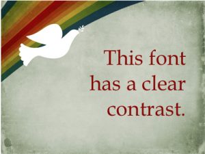
Use fonts with a clear contrast to the backdrop. People need to be able to see the fonts in a PowerPoint sermon. It’s fine to use colors for your fonts; just make sure that those colors contrast clearly with the background. Obviously, a red/blue contrast is definite enought, but too jarring for the eye to make sense of. The best form of contrast is between light/dark tones, not necessarily colors.
Use fonts that are fairly standard. There is a reason that your computer comes preloaded with a set of basic fonts. These are the most readable fonts for a print medium or for projecting in a PowerPoint. Fancy fonts can be fun, and it’s okay to use them in moderation. Just don’t go overboard. Zany fonts can be really hard to read. Script fonts are dangerous, but can be strategically used, such as in the Jesus Lives Easter Sermon Template.
Use only a few fonts. Some people love fonts so much that they feel the need to use a lot of them. Don’t. Using the same fonts consistently isn’t boring; it’s actually very considerate to your viewers. Keep fonts consistent in your PowerPoint sermons.
Don’t use all caps. You probably know that all caps is the typing equivalent of yelling at the top of your lungs. It’s also harder to read. You really don’t need a PowerPoint sermon that yells. Some designers are able to use all-caps strategically, as in the Resurrection Power Sermon PowerPoint but it is a rare tool indeed.
Keep fonts big enough. A common complaint in PowerPoint sermons is that of the size of the text. “It’s too small; we can’t read it in the back.” Rather than asking your people to check their eye prescriptions, check your font size. Font size for PowerPoint sermons depends on the size of the room, the size of the screen, and other factors. However, we recommend that you never use a font smaller than 32-point. You’ll notice that Sharefaith features massive fonts for our PowerPoint sermon lead slides.
Don’t use Papyrus font. The design industry has a running ridicule of the font, Papyrus. Why? Because it’s way overused. It’s everywhere. Entire websites are devoted to the ridicule of Papyrus fonts. Deep down inside, I kind of like the way that Papyrus looks, but it has outlived it’s usefulness for PowerPoint sermons. Use something else for your PowerPoint sermons.
Thousands of PowerPoint worship resources here!


